Greetings Programs!! We just committed our new application icon for Pidgin 3 to version control and we want to hear your thoughts!! So please share them on this post!

2 Likes
I like it a lot (because my opnion matters so much I am sure). I’m not sure how it will look in some edge cases (small on a light background, used in true black-or-white printing which is oh-so-common in 2025…) but I really do think it’s great, looks modern. It looks like it belongs on my phone next to telegram and signal but isn’t some kind of paper airplane thing like every other messenger app.
96/100 - some possible edge case concerns.
1 Like
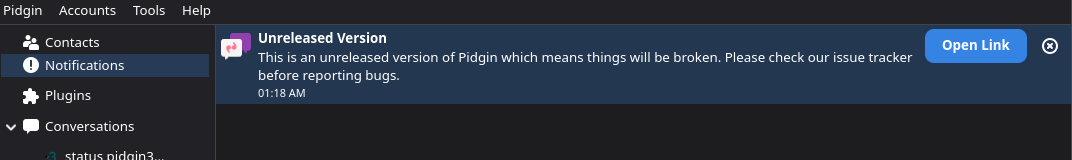
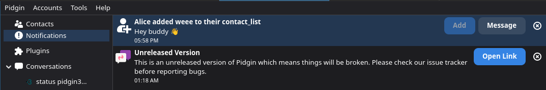
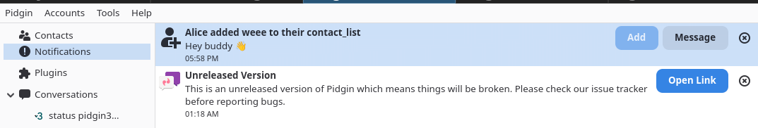
Here’s an example of the icon in the application in light and dark mode as people keep mentioning it.
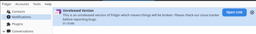
and unselected:
1 Like
I think this looks really nice, and carries the sense of still being Pidgin while looking clean and new. ![]()
1 Like